YouTube has announced a comprehensive visual refresh of its video player, unveiling a redesigned interface that promises to be noticeably cleaner, more streamlined, and considerably more immersive for viewers across all devices. Beginning this week, users will gradually see these enhancements as the company rolls out its modernized look. According to YouTube, the update incorporates a complete overhaul of the player’s aesthetic elements, including refined on-screen controls and newly crafted icons. These adjustments aim not only to elevate the visual appeal of the experience but also to ensure that user interface elements take up less space on the screen, thereby hiding less of the actual video content and allowing the viewer’s focus to remain primarily on what matters most: the video itself.
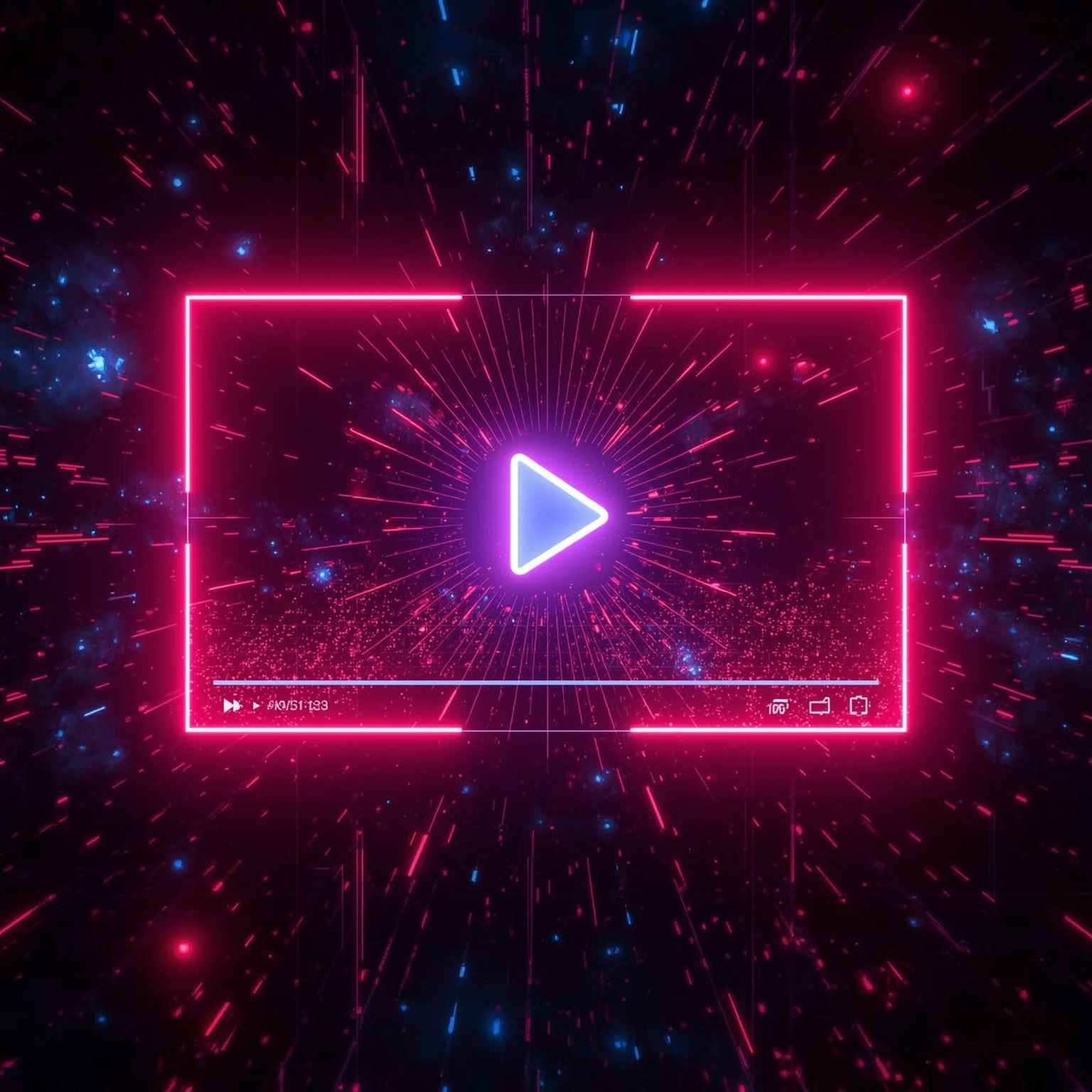
This shift toward a more visually satisfying environment did not emerge overnight. YouTube began experimenting with these design modifications earlier in the year, gathering feedback and testing various iterations of the updated player to better understand viewer preferences. A preview image released by the company showcases some of the notable design touches—rounded buttons integrated directly on-screen, for instance, now exhibit a subtle degree of translucency. This slight opacity lends the interface a contemporary and polished look, which softly complements the content without introducing disruptive reflections or distractions. Interestingly, while this aesthetic nods toward the fluid and luminous qualities popularized by Apple’s well-known Liquid Glass style, YouTube’s interpretation is intentionally more restrained, adopting a gentler effect that preserves clarity and usability.
Importantly, YouTube has confirmed that this improved player will be made available universally across its mobile application, standard web interface, and television-based platforms, ensuring that users enjoy a consistent and enhanced viewing atmosphere regardless of the screen they use. This cross-platform coherence highlights YouTube’s ongoing commitment to design uniformity and accessibility—core principles in its continual evolution of digital media experiences.
Beyond the player’s visual transformation, YouTube is simultaneously rolling out an array of supplementary updates designed to refine overall interactivity. Among these is an upgrade to the double-tap to skip feature, a widely used gesture for navigating through videos. The company describes this enhancement as a modernization of the familiar tool, created to provide smoother functionality that feels less intrusive within the context of video playback. Additionally, YouTube is introducing a more structured and systematic approach to managing comment replies. By organizing responses more effectively within the replies panel, this new arrangement seeks to deliver a more concentrated and orderly reading experience, allowing viewers to follow conversations with greater ease and clarity.
In a further move to enrich engagement and playfulness on the platform, YouTube has added new dynamic animations that visually respond when a user presses the like button. For instance, when watching a music video, users may see a lively animation such as a colorful music note appearing momentarily—an expressive element intended to celebrate the act of appreciation in a small but memorable way. Collectively, these refinements illustrate YouTube’s deliberate pursuit of an interface that feels both more sophisticated and more human, turning every viewing session into an experience that is not just functional, but aesthetically engaging and emotionally resonant.
Sourse: https://www.theverge.com/news/799492/youtube-new-video-player-update-changes