Apple has officially released its most recent significant iPhone operating system update, iOS 26, and this new iteration introduces one of the boldest visual overhauls in years. At the heart of this update is a completely reimagined design language that Apple has chosen to call *Liquid Glass*. The intent behind the name becomes immediately clear once you begin using the system: nearly every element on your device now gleams with a polished, glass-inspired aesthetic that fundamentally alters how the iPhone interface both looks and feels.
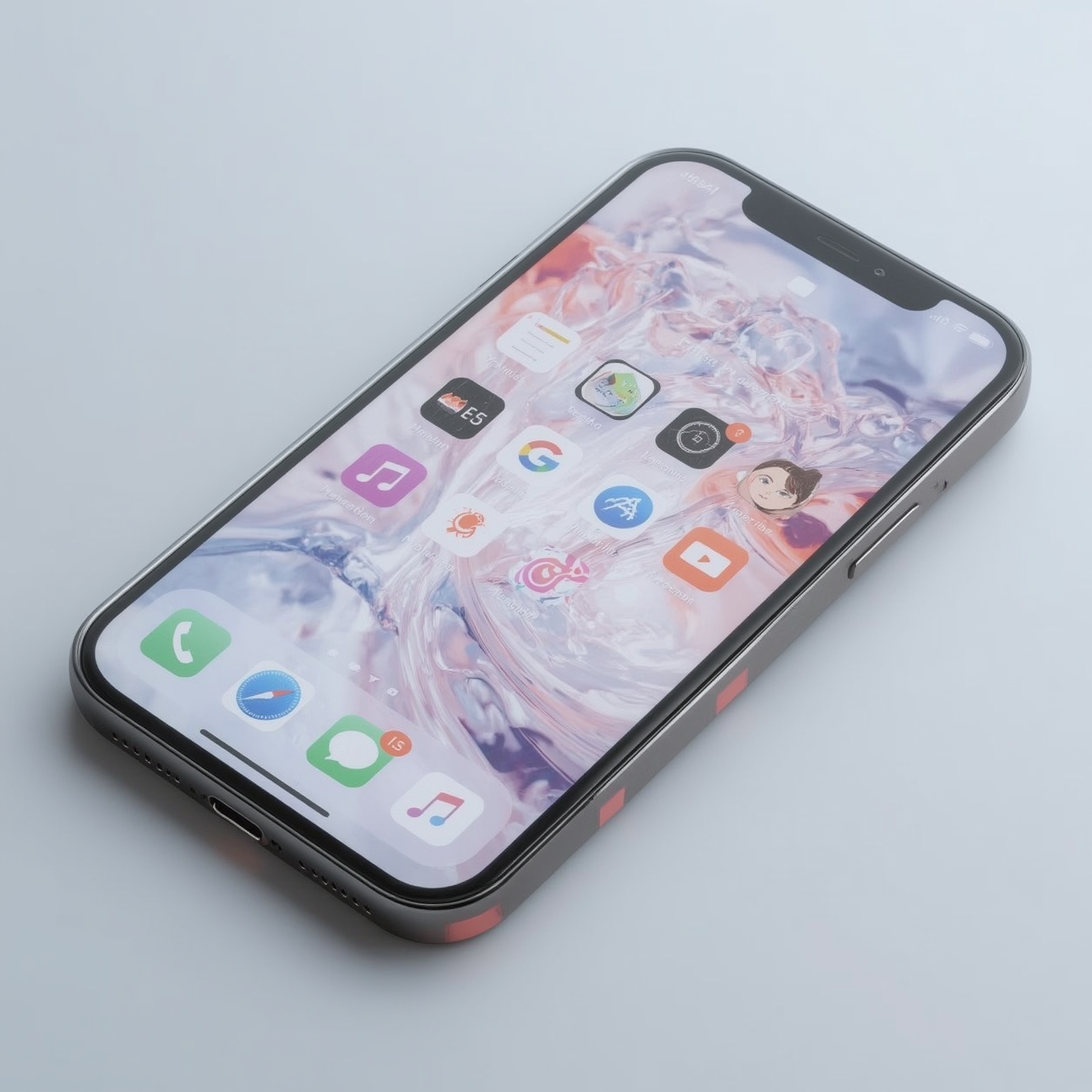
Liquid Glass permeates nearly every corner of the operating system. Iconography and interface components now shimmer as though sculpted directly from solid glass, characterized by softly beveled edges and reflective highlights that respond subtly to light. When users interact with text, such as pressing and holding to magnify characters, the familiar lens-like effect has been replaced by a bulbous, glass-like orb that refracts surrounding visuals while enlarging the words beneath it. Browsing in Safari reveals another striking element of this redesign: as webpages glide up and down, interface components such as the search bar and back button appear semi-translucent, allowing content to slide elegantly beneath them. Notifications, too, have undergone a complete transformation; instead of solid, opaque cards, alerts now drift across the homescreen like transparent overlays, creating the impression of floating panes of clear glass. Even the dock at the bottom of the home interface and the modular controls within Control Center exhibit dynamic light refractions, shifting their appearance depending upon the tilt and orientation of the iPhone in your hand.
Apple has emphasized this new design direction with visuals and promotional showcases, highlighting the sheer breadth of areas where Liquid Glass surfaces throughout the system. The effect is quintessentially Apple: ambitious, glossy, and unafraid to take risks in redefining what users expect from their devices. Yet despite its dramatic presence, these changes can initially feel disorienting for long-time iOS users. Since the radical redesign of iOS 7 more than a decade ago, which ushered in an era of flat and minimalistic visuals, the iPhone’s visual identity has remained largely restrained and two-dimensional. By contrast, iOS 26 reintroduces depth and texture—albeit virtually—infusing translucency and dimension in ways that are undeniably eye-catching but also potentially distracting until one becomes accustomed to them.
Early iterations of Liquid Glass did not arrive without their challenges. Test versions of the software revealed that the interplay of translucency and background content sometimes resulted in significant legibility issues, as text and controls could blur into the shifting scenery behind them. During the extended beta process, Apple repeatedly adjusted and recalibrated the interface, refining contrast levels, modifying layering effects, and adjusting animations to enhance practical usability while retaining the desired aesthetic. Nonetheless, once the software reaches millions of everyday users, Apple will almost certainly continue refining details in response to widespread feedback and criticism.
As someone who has used Liquid Glass extensively for the past three months on a primary iPhone, the adaptation period has been interesting. Over time, what once seemed visually overwhelming gradually became more familiar and natural, to the point where the new style no longer feels obtrusive. In daily usage, the experience is ultimately functional: although the graphical presentation has shifted dramatically, the actual foundations of the operating system—the gestures, the layouts, the app behaviors—remain essentially the same as in iOS 18. The phone continues to operate with its characteristic efficiency, even if everything now appears refracted through shinier, more luminous veneers.
Of course, not everyone will welcome this transformation. Given Apple users’ tendency to coin irreverent nicknames, criticisms have already emerged branding the new design as ‘Liquid Ass,’ a mocking counterpoint to Apple’s marketing. And it would be unsurprising if public opinion leads to further incremental adjustments in subsequent updates, just as occurred during the testing phase of iOS 26. What seems unmistakable, however, is Apple’s commitment to this design language. The company is simultaneously extending Liquid Glass across its wider ecosystem, signaling that this is not simply a temporary experiment but rather a new defining visual identity. In practical terms, this means that whether users admire the look or recoil from its extravagance, they will likely need to grow accustomed to interacting with it on a daily basis for the foreseeable future.
Sourse: https://www.theverge.com/apple-ios/777383/iphone-ios-26-liquid-glass-redesign-look