This week, Apple once again captured the attention of the tech world with a sweeping wave of announcements that underscored its ongoing dominance in design and innovation. The company unveiled a host of new products, ranging from the cutting-edge iPhone 17E to a series of lightning-fast MacBook Pro laptops powered by the new-generation M5 Pro and M5 Max processors. Yet, despite the impressive performance upgrades and premium builds of these flagship devices, the most talked-about release wasn’t the high-end Pro models—it was the unexpectedly affordable and stylish MacBook Neo.
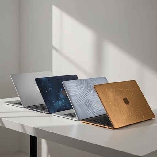
The MacBook Neo immediately became the focal point of discussion across both tech circles and social media for its inviting price point and appealing design ethos. The entry-level model, which features 256GB of storage, starts at just $599, while the upgraded 512GB configuration sells for $699. At these prices, Apple seems to be strategically positioning the Neo as a bridge between budget-conscious consumers and the brand’s traditionally premium image—something that hasn’t gone unnoticed. Still, for all the conversations about value and specs, there’s one aspect that undeniably stole the spotlight: the striking palette of new colors.
Available in four distinct shades—silver, blush, citrus, and indigo—the Neo line has sparked lively debates among staffers at CNET, each with strong opinions about which color deserves the crown in what they’ve affectionately dubbed “the office beauty pageant.” Predictably, silver, Apple’s timeless and default hue, landed at the bottom of the ranking. While few were surprised by this outcome, the consensus was that many consumers are craving something fresh, expressive, and more personal than the traditional metallic finish. Despite the loss of enthusiasm among reviewers, some admitted that the classic silver MacBook will likely continue to sell well, thanks to its universal appeal, minimalist aesthetic, and its association with Apple’s heritage of sleek simplicity.
The remaining three colors—blush, citrus, and indigo—received far more affection, with citrus and indigo emerging as the clear leaders in terms of staff preference. The Neo’s color availability, listed from top to bottom as blush, silver, indigo, or citrus, inspired an almost artistic debate among the CNET team. Managing Editor Josh Goldman reported that at Apple’s New York launch event, citrus seemed to attract the most attention from attendees. Yet in a candid aside, he admitted that he personally wasn’t drawn to the shade, describing it as a “yellow-green” he didn’t particularly care for. Senior Copy Editor Sarah McDermott was even more direct in her critique, labeling citrus as “the worst of both worlds.” Both she and Goldman ultimately favored the blush pink finish, with Goldman noting its versatility—how it delicately transitions from silver to soft pink tones depending on the lighting conditions, offering a dynamic yet understated finish.
Senior Editor Lori Grunin echoed this sentiment, voicing her dislike for the citrus shade with her characteristic wit: “Get your green out of my yellow,” she quipped. She favored the blush tone for its charm, though she acknowledged her general aversion to fully pink devices, deeming all-pink designs a bit too overtly playful. If she were to purchase the Neo herself, she said, her choice would be the indigo version, a view that many colleagues shared. Indeed, that elegant indigo hue narrowly claimed the highest number of votes, and its appeal is easy to understand. It exudes a sense of calm sophistication, reminiscent of the rich blue tones seen on the iPhone 17 Pro—a shade that conveys professionalism while still feeling fresh and distinctive.
Meanwhile, Senior Editor James Bricknell offered a more nuanced perspective. While he compared the citrus color to a lemon that hasn’t fully ripened—more subdued than vibrant—he nonetheless found it to be his personal favorite. He admitted with a smile, “Full disclosure: my iPad is also yellow. It’s simply the most fun color that Apple makes.” That sense of playful energy resonated with a few others on the team as well, including the author of this discussion, who also listed citrus as a top choice, with indigo coming in a close second. Acknowledging a general disinterest in pastel hues, the author nevertheless confessed an appreciation for the blush model’s gentle subtlety, describing it as undeniably pretty and tastefully understated.
When all the votes were tallied, the results showed a clear, though closely contested, ranking. Indigo rose to first place, capturing 38% of the internal poll. Citrus followed closely behind with 35%, blush earned a respectable 23%, and silver lagged far behind at just 4%. The verdict was unmistakable: traditional silver, once considered the default of modern tech sophistication, is now perceived as the least inspiring option in Apple’s updated color repertoire.
The writer closed with a note of nostalgia. Many within the CNET office—and certainly, many long-time Apple enthusiasts—miss the brand’s bolder design era, when products gleamed in vibrant, saturated tones rather than the desaturated, pastel-inspired finishes that dominate today’s aesthetic landscape. The author compared the current palette trend to the visual identity of a beverage like LaCroix: soft, washed-out, and intentionally understated. Yet for some fans, that minimalism has come at the expense of personality. They long for the return of striking shades reminiscent of the Product (Red) collection or the classic, vividly colored iBooks that once defined Apple’s playful side.
Social Media Manager Faith Chihil voiced exactly that desire, calling for a revival of the transparent iBook look that once captured hearts in the early 2000s. Goldman, ever pragmatic, noted that the plastic shells of Apple’s past have likely been phased out permanently, given the company’s modern focus on aluminum unibody construction and sustainability. But Senior Writer Jeff Carlson interjected with a clever twist, jokingly suggesting a compromise: “Yes, but what about transparent aluminum? (Which is real now!).” It was a comment that struck a chord—merging nostalgia with futuristic possibility, hinting that even in Apple’s polished world of metal and glass, a bit of whimsy remains.
As for consumers eager to experience these new releases firsthand, Apple has already made the entire lineup available for preorder. All newly announced devices, from the revamped MacBook Neo to the iPhone 17E and the M5-powered MacBook Pros, are set to ship officially on March 11. Whether buyers lean toward citrus playfulness, indigo elegance, blush subtlety, or the clean familiarity of silver, it’s clear that Apple’s thoughtful balance between performance and personality continues to spark passionate dialogue—and perhaps even rekindle a little color nostalgia in the process.
Sourse: https://www.cnet.com/tech/computing/cnet-judges-macbook-neo-colors/