Thirteen years have elapsed since Domino’s Pizza last underwent a major update to its brand identity, and the company is once again demonstrating that even a long-established industry leader must remain vigilant, innovative, and proactive rather than resting on past accomplishments. As the world’s largest pizza chain by both annual sales and the number of stores, Domino’s unveiled its comprehensive rebranding initiative on Wednesday—an ambitious effort marking a deliberate evolution of its image and consumer experience.
Kate Trumbull, the Chief Marketing Officer of Domino’s, explained in an interview with Business Insider that this rebrand was far from a quick visual refresh. Instead, it was a carefully orchestrated, twenty-month creative journey encompassing the development of a redesigned logo, new packaging aesthetics, and an original jingle—all centered around a guiding ethos she encapsulates simply but powerfully: “There’s risk in doing nothing.” Trumbull elaborated that many companies only revisit their brand identity when struggling to remain relevant or facing declining performance. However, Domino’s chose to embark on this project from a position of strength, seeking to stay ahead of the curve rather than react to market pressures. While acknowledging that change inevitably involves some level of uncertainty, she emphasized that stagnation can be far more perilous. In her view, fear of change can trap even successful organizations in complacency, choking their ability to innovate and adapt.
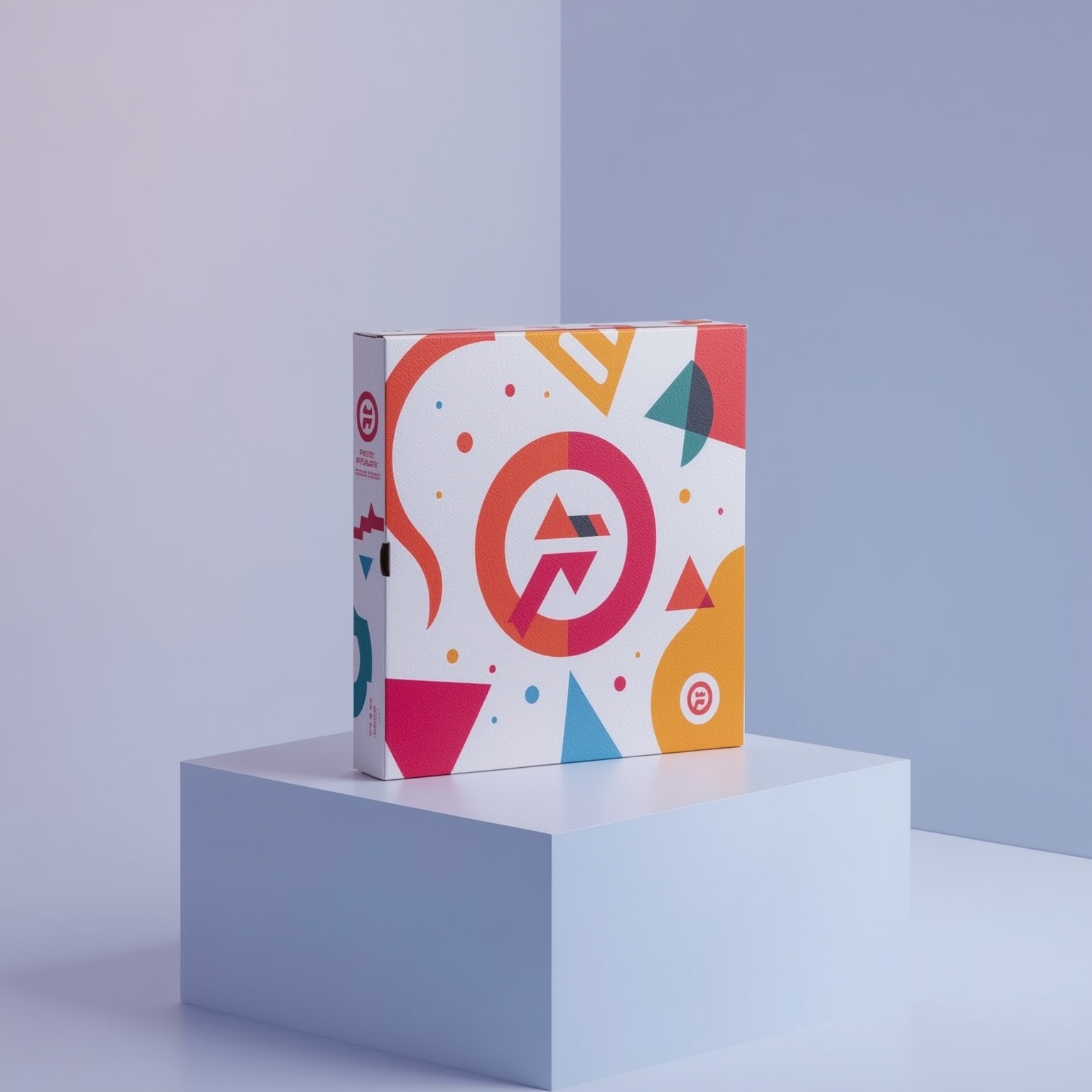
The rebrand ushers in an updated visual system featuring a refined font, along with more vibrant and saturated shades of red and blue that infuse the packaging with energy and contemporary flair. Complementing the visual overhaul is a fresh musical component— a playful jingle titled “Dommmino’s,” recorded by renowned hip-hop artist Shaboozey — designed to reinforce brand recognition through audio identity. Furthermore, in-store employees will soon sport updated apparel, ensuring that consumers experience the rebrand cohesively across every touchpoint, from marketing materials to face-to-face interactions.
Trumbull noted that Domino’s is acutely aware of the risks that accompany large-scale aesthetic changes and has therefore taken great care to learn from other companies whose rebranding efforts did not resonate with their audiences. To mitigate such risks, Domino’s relied heavily on extensive market research, consumer testing, and data-driven insights before committing to its new direction. This careful groundwork exemplifies the brand’s methodical approach to reinvention—balancing creativity with analytical rigor. The company also intends to introduce additional updates in the near future, which may include the remodeling of stores and the introduction of new menu offerings, though these forthcoming changes will only be announced after the team measures the success of this initial rollout.
Preliminary findings from Domino’s internal research indicate that customers have responded enthusiastically to the refreshed visual identity. Respondents described the new branding as noticeably more dynamic, modern, and expressive — adjectives such as “vibrant,” “bold,” “fun,” “playful,” and “contemporary” repeatedly emerged from feedback sessions. This positive response suggests that the redesign is succeeding in reinvigorating the brand’s personality and in strengthening its emotional appeal.
Speaking about the future trajectory of the project, Trumbull noted that while the brand has not yet initiated physical changes to store environments, the new branding will serve as a conceptual and aesthetic foundation for future updates across both U.S. and international markets. “This refresh,” she said, “will inspire what comes next.” Her statement underscores the company’s forward-looking mindset—a strategic effort not merely to modernize for the moment but to seed long-term creative evolution.
Jean-Pierre Lacroix, President of the strategic design firm Shikatani Lacroix Design, reinforced this perspective in his commentary to Business Insider. He observed that Domino’s transformation amplifies its personality and deepens its emotional bond with customers. According to Lacroix, ordering a pizza inherently represents a joyful, rewarding experience—one that ought to feel like a small celebration. The brand’s new look captures that spirit effectively. The bold color palette and lively design elements express the sensation of indulgence and excitement associated with sharing pizza, whether as a personal treat or a communal delight. “When people celebrate,” he explained, “they instinctively gravitate toward bright, inviting visuals—symbols of happiness and enjoyment. Domino’s has created an atmosphere that embodies exactly that emotional essence.”
Following the announcement, Domino’s stock remained largely stable throughout the trading day, with only a modest increase recorded during after-hours trading. This measured response likely reflects investor confidence in the company’s long-term strategy rather than short-term anticipation. Ultimately, the brand’s decision to evolve while maintaining its core identity demonstrates a balance between continuity and innovation—a reminder that even the most successful enterprises must periodically reinvent themselves to preserve relevance in an ever-changing marketplace.
Sourse: https://www.businessinsider.com/dominos-cmo-rebrand-new-logo-jingle-2025-10