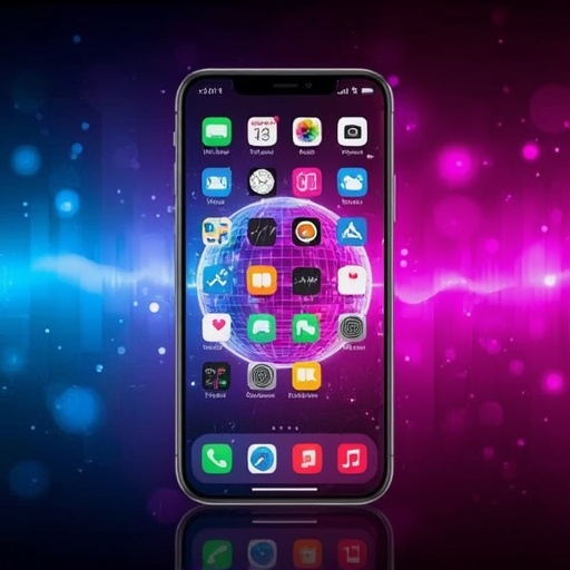
Google has once again managed to capture the spotlight by merging technology with a flair for artistic expression, unveiling a homescreen experience that feels as though it stepped right out of a retro nightclub. The tech giant recently introduced a series of dazzling disco-ball style icons for its Pixel devices, a design move that shimmers with nostalgic glamour while maintaining a distinctly futuristic sophistication. Each icon gleams with a mirrored surface texture, catching ambient light and reflecting it back in countless subtle hues, evoking the atmosphere of a classic dance floor refracted through the prism of modern digital aesthetics.
This update transforms routine interactions with one’s smartphone—checking messages, opening apps, or simply glancing at the home display—into moments of delight and visual intrigue. It’s an unexpected yet deliberate celebration of design playfulness, showing Google’s continuous effort to balance utility with expressive personalization. The disco motif, reminiscent of the cultural exuberance of the 1970s, reappears here not merely as ornamentation but as a quietly provocative statement about how technology can convey mood, personality, and even nostalgia within its minimalist framework. For users who prefer clean, subdued iconography, this shimmering leap might initially feel like aesthetic excess. Yet for others, particularly those enamored with digital novelty and creative self-expression, it represents a refreshing experiment—proof that even the home screen, so often seen as purely functional, can become a canvas for luminous individuality.
Underlying this visual transformation is a deeper design philosophy. Google’s decision illustrates the company’s awareness of growing user desire for customizable, emotionally resonant digital environments. As devices become extensions of identity, there is greater demand for design languages that blend warmth and charm with the cool precision of technological craftsmanship. The glittering icons exemplify precisely that synthesis: they sparkle with playfulness but retain a geometric uniformity that harmonizes effortlessly with Android’s sleek interface.
In essence, this isn’t just a decorative update; it’s an invitation to reimagine our devices as expressive companions rather than mere tools. By infusing an everyday UI with the rhythmic vivacity of a disco ball, Google reminds us that design innovation thrives when imagination dances hand in hand with function. Whether users ultimately embrace the gleam or retreat to simplicity, these icons ensure that the conversation around visual design—and the role of joy in technology—continues to shine brightly.
Sourse: https://techcrunch.com/2026/05/22/google-goes-for-the-glitter-with-disco-ball-icons-are-yall-sure-you-still-want-this/